In the modern landscape of marketing, the role of art has become increasingly significant. Artistic elements are not merely decorative; they are powerful tools that can captivate an audience, convey complex messages, and drive engagement. The principle of “less is more” has emerged as a crucial guideline, emphasizing the importance of simplicity and clarity in visual communication. This technical article explores how art plays a vital role in marketing and how minimalistic approaches can effectively capture the audience’s attention, using real-life examples.
The Intersection of Art and Marketing
Art in marketing encompasses a wide range of visual elements, including imagery, design, typography, and color schemes. These components work together to create a cohesive visual identity that resonates with the target audience. The primary goals are to evoke emotions, enhance brand recognition, and communicate key messages effectively.
Visual Storytelling
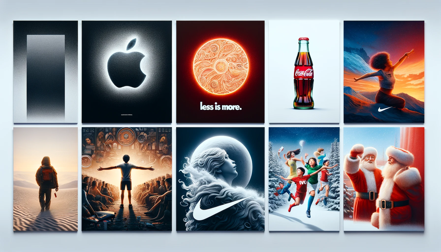
Visual storytelling leverages images, videos, and graphics to convey narratives that resonate with viewers on an emotional level. For example, Nike’s “Just Do It” campaign uses powerful imagery and minimal text to tell stories of perseverance and triumph, creating a deep emotional connection with the audience.
Brand Identity and Consistency
Art plays a crucial role in establishing and maintaining a brand’s identity. Consistent use of specific colors, fonts, and design elements helps create a recognizable brand image. Apple’s branding is a prime example, where the minimalist design of its products and marketing materials reinforces its identity as a premium, user-friendly technology company.
Captivating an Audience: The Art of Engagement
To effectively captivate an audience, marketers must understand the psychological impact of visual elements. Here are some key strategies:
1. Emotional Appeal
Art has the power to evoke emotions, and emotional engagement is a critical factor in marketing success. For instance, Coca-Cola’s holiday campaigns often feature heartwarming scenes and vibrant colors to evoke feelings of joy and nostalgia, strengthening its brand association with happiness and celebration.
2. Visual Hierarchy
Establishing a clear visual hierarchy ensures that the most important elements of a design are noticed first. Techniques such as size variation, contrast, and placement guide the viewer’s eye to key information. McDonald’s “I’m Lovin’ It” campaign uses a clear visual hierarchy with its logo and tagline prominently displayed, ensuring immediate recognition and retention.
3. Simplicity and Clarity
The principle of “less is more” is particularly relevant in the context of art in marketing. Overly complex designs can overwhelm and confuse the audience, leading to disengagement. Simplified designs, on the other hand, are easier to process and more likely to leave a lasting impression. Google’s homepage is a classic example, with its clean, uncluttered design emphasizing the search function, making it straightforward and user-friendly.
The Principle of ‘Less is More’
Minimalism in art and design is not about stripping away all elements but about prioritizing what truly matters. Here’s how the principle of “less is more” can be effectively applied in marketing:
1. Focus on Core Elements
Identify the essential components of your visual message and focus on them. Remove any superfluous elements that do not contribute to the overall goal. Apple’s advertising often focuses on a single product against a plain background, highlighting the product’s design and features without distractions.
2. Use of White Space
White space, or negative space, is the empty area around design elements. It helps to create a sense of balance and allows the viewer’s eyes to rest. Proper use of white space can make designs appear more elegant and sophisticated. The luxury brand Chanel uses significant white space in its advertisements to convey a sense of elegance and exclusivity.
3. Consistent Color Palette
A limited and consistent color palette reinforces brand identity and enhances visual coherence. By using a few carefully selected colors, marketers can create a harmonious and aesthetically pleasing design. Spotify’s use of a consistent green and black color scheme across its marketing materials ensures instant brand recognition.
4. Typography Matters
Typography is a crucial element of minimalist design. Choosing the right fonts and using them consistently can significantly impact the readability and visual appeal of the content. Simple, clean fonts are often more effective in conveying messages clearly and elegantly. The New York Times uses classic, serif fonts that reinforce its identity as a reliable and authoritative news source.
Conclusion
Art in marketing is a powerful tool that, when used effectively, can captivate an audience and drive engagement. By embracing the principle of “less is more,” marketers can create impactful, memorable, and visually appealing campaigns. Simplified designs, emotional appeal, clear visual hierarchy, and consistent branding are key strategies to leverage the full potential of art in marketing. Real-life examples from companies like Apple, Nike, and Coca-Cola illustrate how effective use of art can enhance brand identity and connect with audiences on a deeper level. In an age where attention spans are short, the ability to communicate messages succinctly and beautifully is more valuable than ever.